Elevate Your Look
Uncovering the secrets to getting your cushion styling right every time!

If you’re like me, you take your cushion style seriously. After all, they’re the perfect way to inject a little personality into any room. But sometimes it’s hard to know exactly how to mix and match patterns and textures without ending up with a disaster. If that sounds like you, don’t worry – I’ve got you covered. Check out my foolproof tips for getting your cushion style right every time. You’ll be glad you did!
Min and Match
How to pair your cushions like a pro.
We’ve all seen those amazing rooms with like a zillion patterns going on and you’re thinking, “How the hell do they do that without it looking like a hot mess?” Well, I’m here to tell you that there is a science and art to it and a perfect way to mix three (or more) patterns successfully, the big secret is as simple as sticking to one colour palette.
By choosing just a couple of colours and incorporating them into each of your patterns, you’ll create a cohesive look that doesn’t feel too busy. So whether you’re going for a traditional or modern vibe, keep reading for some pattern mixing tips that will have your home looking chic in no time!
With a little planning and knowledge you can prevent wasting money on cushions that don’t work, ever again.
Asses the size of your furniture
How high the back of the sofa? If it is on the shorter side, then a 60×60 euro is out, and even a 45cm pillow sizes may be too big. For a shorter height, you can try rectangular pillow, or lumber cushion. Do your armchairs need a tiny pop of cushion, a big feature, stylised rectangle cushions or nine at all? Like all things design, Planning and considering your needs will get you your best outcome.
Invest and back yourself.
Lock in your colour palette
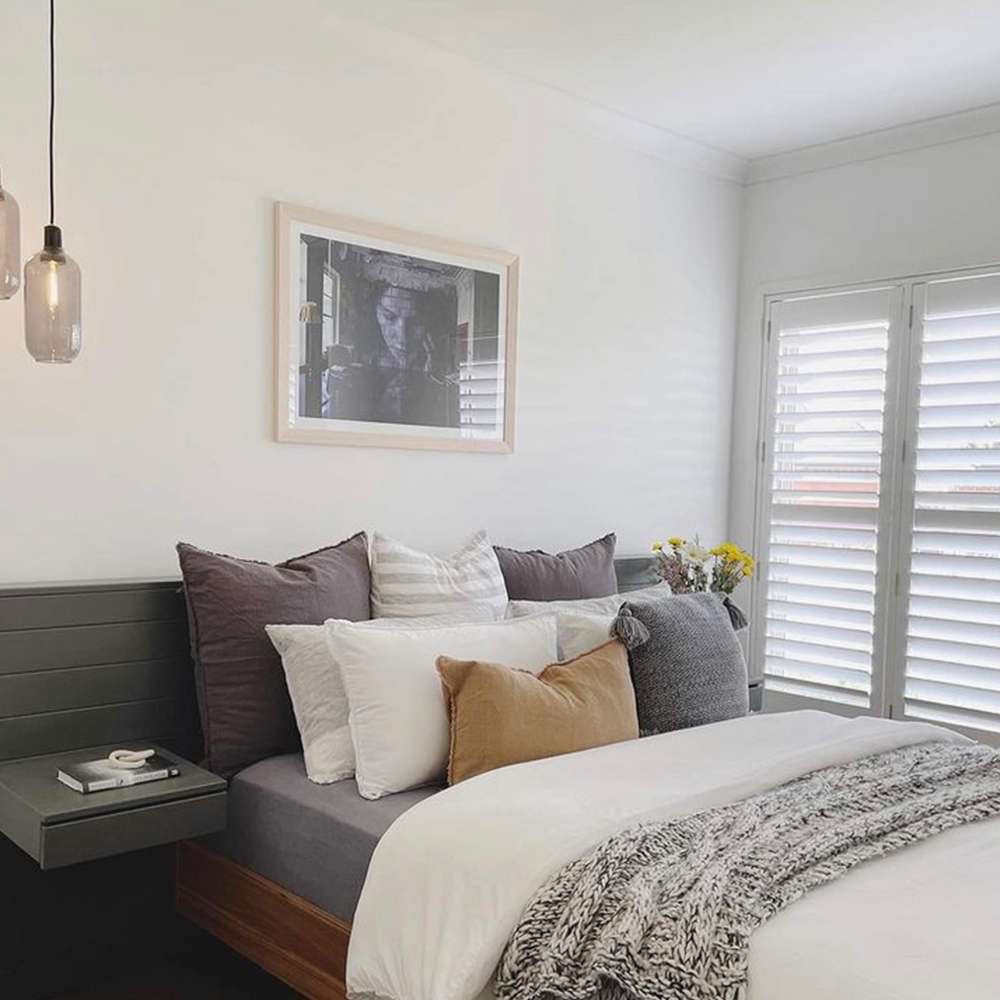
Use darker colours or bolder patterns to create depth in a neutral room, alternatively neutral cushions may compliment your style (coastal, boho etc)
Mix up the size and shape
I like one large, one standard and one rectangle personally, but you can entertain a round cushion, all 50×50, the 2-1-2 method ‘Choose two solid coloured larger scatter cushions that pull together the different tones in your room.
Then, select some slightly smaller ones with different patterns but similar colour palettes to sit on front of these. Finish off your arrangement with a small rectangular cushion in the middle that is patterned with similar tones as your two solids.’
Always use feather inserts
Always. They bring a level of luxe unparalleled by other fillings.
Explore different patterns & textures – my go to here is one block colour, one pattern cushion and one textural. Think knots, furs, linens, velvet, anything goes. Adding texture creates visual interest.
Change your cushion covers seasonally – my husband makes me abide by the ‘one in one out” rule and thus I’ve gotten very good at buying new “covers” to fit my existing feather inserts and ditching the polyester filling to my local thrift store. In autumn and winter I always like to introduce knots and warm layers and throws and deeper colours like tan and olive, in the summer I stick with lighter earthy tones like blush and sage.
Reviews
A neutral palette doesn’t have to be boring
A neutral palette doesn’t have to be boring. The key to making it really stand out is with contrast and is achieved with the depth of color that reflects the style outcomes you’re wanting to acheive.
Rhiannon Lee -Easy Ways to Add Japandi Style to Your Home, The Spruce

